 |
| Lifted right off the Pantone site |
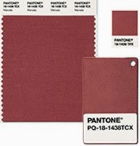
Every year, Pantone predicts which color designers and consumers will be buying over the next year. They describe this year's color as "a naturally robust and earthy wine red."
It is named for a fortified Sicilian wine, and Pantone hopes it will embody the satisfying richness of a fulfilling meal...emanating a sophisticated, natural earthiness.
They claim it is universally appealing, but press has shown that is not really the case. Marsala has had some unfavorable comparisons in the design trade. (Go HERE to read what Kristin Hohenadel has to say.)
 |
| Lisa, wisely, does not wear the color next to her skin for she knows it is not a good one for her. |
 |
| Silks waiting to become saris in India |
I don't know if I would call it sultry. In fact, I think some publicist or assistant got the name WRONG, looked it up, and concluded it was a fortified wine. I think they originally meant MASALA, which is Arabic for seasoning, and is favored in food from the Indian sub-continent. Surely SULTRY is a great descriptor for for THAT.
 |
| Powders awaiting the Holi Festival, or Festival of Colors |
Pantone has some "color pairings" (more WINE imagery), but just like last year, I see a LOT of Walmart blue and pink. Just yuck.
Here are Aquamarine, Scuba Blue, Lucite Green, and Classic Blue. If you ever go to Walmart to buy women's T-shirts, you will see some familiar colors. First of all, just because it is called AQUAMARINE, doesn't mean it has any relationship to aqua, or marine blue. In fact, it is really just plain old baby blue. I put a little square of Marsala in the corner. They do not do much for each other.
.jpg)
Nor does SCUBA do much besides remind me of my favorite turquoise shirt which I have to keep buying over and over because I don't wear a bib when I eat. (I complain about the typical Walmart blues and pinks but turquoise ALWAYS gets an exemption from me, no matter the origin.)
LUCITE ? No. Lucite evokes CLEAR and TRANSLUSCENT. This rendition is too muddy. Marsala doesn't like it, and neither do I.
CLASSIC didn't have much of a chance. I think it would be luscious as a small accent color with the Marsala, but I have the proportion wrong to show it to its best advantage.
.jpg)
.jpg)

.jpg)
 |
| MUCH, much better, don't you think? FSU fans say YES. |
 |
| Harvested Saffron...........................Saffron in flower |
Check the three colors Mother Nature put with Marsala: lavender, emerald, and saffron. Look at her proportions, too. She gets it right most of the time.

No comments:
Post a Comment